I recently came across an article on Life Edited that discussed a study of how families utilize the space in their homes. The study tracked the movement of 32 families in the Los Angeles area over two days.
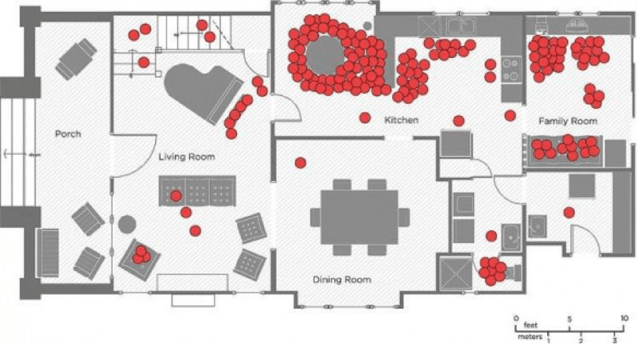
Each dot on the diagram below represents the location of one family member during a 10-minute interval. Not surprisingly, most families spend much of their evenings congregating in the kitchen and family room and very little attention is given to the porch or dining room. The article goes on to discuss how the space in homes could be optimized to accommodate the way families actually use it.
This brings up some interesting parallels to organizational culture. What if we used data visualization to map the movement of people within our workspaces? What insights would we find?
Facilitating Collaboration
By applying the same principles laid out in the article, we would be able to determine which areas of our office are utilized more frequently. For instance, maybe the shared kitchen space is a significant congregation area throughout the day, but conference room #2 is only use for 30 minutes in the afternoon. At a very high level we can use this information to help design effective workspaces that facilitate communication and optimize the use of shared spaces.
Taking those insights further, we can explore how those workspaces are utilized. For instance, maybe the kitchen is not only a place to grab lunch but also where employees casually discuss business and some ideas they have for a new product line. In this sense, the kitchen serves both as a source of camaraderie and a facilitator of innovation. This example may be a stretch, but it’s fairly easy to see how different spaces support different aspects of the organization’s culture.
These insights would help us identify the key hubs where the “actual work” (i.e. the side conversations, backroom deals, and brainstorming sessions that keep organizations moving) happens.
Enhancing Impact
From a leadership perspective, this information can help streamline and enhance the way organizations convey critical information.
By identifying the key congregation hubs and the type of discussions that are taking place, leaders now know where to place information (ex. update on a new safety policy), the content of the message (ie. use a humorous tone in the kitchen space), and the type of media to use (ex. quick graphic, display on a TV screen, a copy of the document, speaker announcement, etc.). This could help improve the way information is disseminated and reduce the likelihood that coworkers are oversaturated with information that does not resonate well.
“Casual Collisions”: Applications in the Business World
Companies from Pixar to Google have taken a similar approach to developing workspaces. Their approach (or philosophy really) is called “casual collisions” where office space is configured to optimize collaboration and facilitate employee interactions. As Steve Jobs once said “creativity comes from spontaneous meetings, from random discussions. You run into someone, you ask what they’re doing, you say ‘wow,’ and soon you’re cooking up all sorts of ideas.” Buildings, floors, hallways, and meeting spaces can all serve as a medium to foster creativity.
Google, while in the process of designing its new headquarters in 2013, felt that it was necessary to methodically plan out the configuration of the building to facilitate collaboration. To do this they conducted studies to determine how employees worked, what kind of spaces they preferred, and what groups/departments want to be close to each other. As a result, Google was able to configure the 1.1 million square foot building so that no employee would be more than a 2.5 minute walk from others they frequently collaborate with.
To push this concept further, an article published in the New York Times in 2013 provided a vision for the future, stipulating that through a combination of sensors, analytics, and technological improvements, offices could reconfigure each morning (by using sophisticated algorithms) to fill in structural gaps and place critical groups in closer proximity to address pressing tasks and challenges.
While that may seem like science fiction, there is evidence to suggest that more and more organizations are turning to analytics to figure out how to configure workspaces to ensure the right people are making connections.
Conclusion
It is likely that not every organization can conduct a study of this kind; factors such as costs, square footage, and geographic proximity of key departments can all limit the feasibility of this approach.
Still, data analytics can go a long ways to enhancing how we see our office spaces and can help leaders think more critically about how to improve organizational collaboration and communication to their team members through design.